The Seaborn objects interface, introduced in version 0.12.0, is a new system based on the Grammar of Graphics, similar to R’s ggplot2. It offers a more consistent and flexible API, comprising a collection of composable classes for transforming and plotting data. This interface allows for end-to-end plot specification and customization without dropping down to the matplotlib level, making it suitable for more complex plots with multiple layers and mark types. While the interface is still experimental and incomplete, it provides a modular and Pythonic API that is informed by ggplot2’s design philosophy. In this post, I replicate the plots from the ggplot2 book using the seaborn objects interface.
This is a work in progress.
Getting started
# load libraries and import mpg data
import seaborn.objects as so
import polars as pl

mpg = pl.read_csv("https://raw.githubusercontent.com/tidyverse/ggplot2/main/data-raw/mpg.csv")
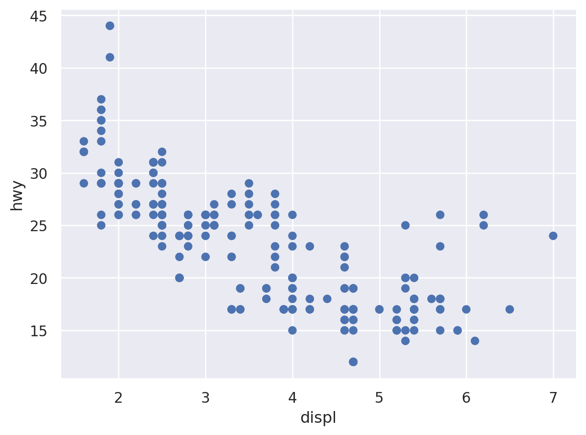
Simple dot plots
there’s also so.Dots() which sometimes looks nicer, but I stick to so.Dot() to keep it similar to ggplot.
ggplot
ggplot(mpg, aes(displ, hwy)) +
  geom_point()
seaborn
(
    so.Plot(mpg, x="displ", y="hwy")
    .add(so.Dot())
)
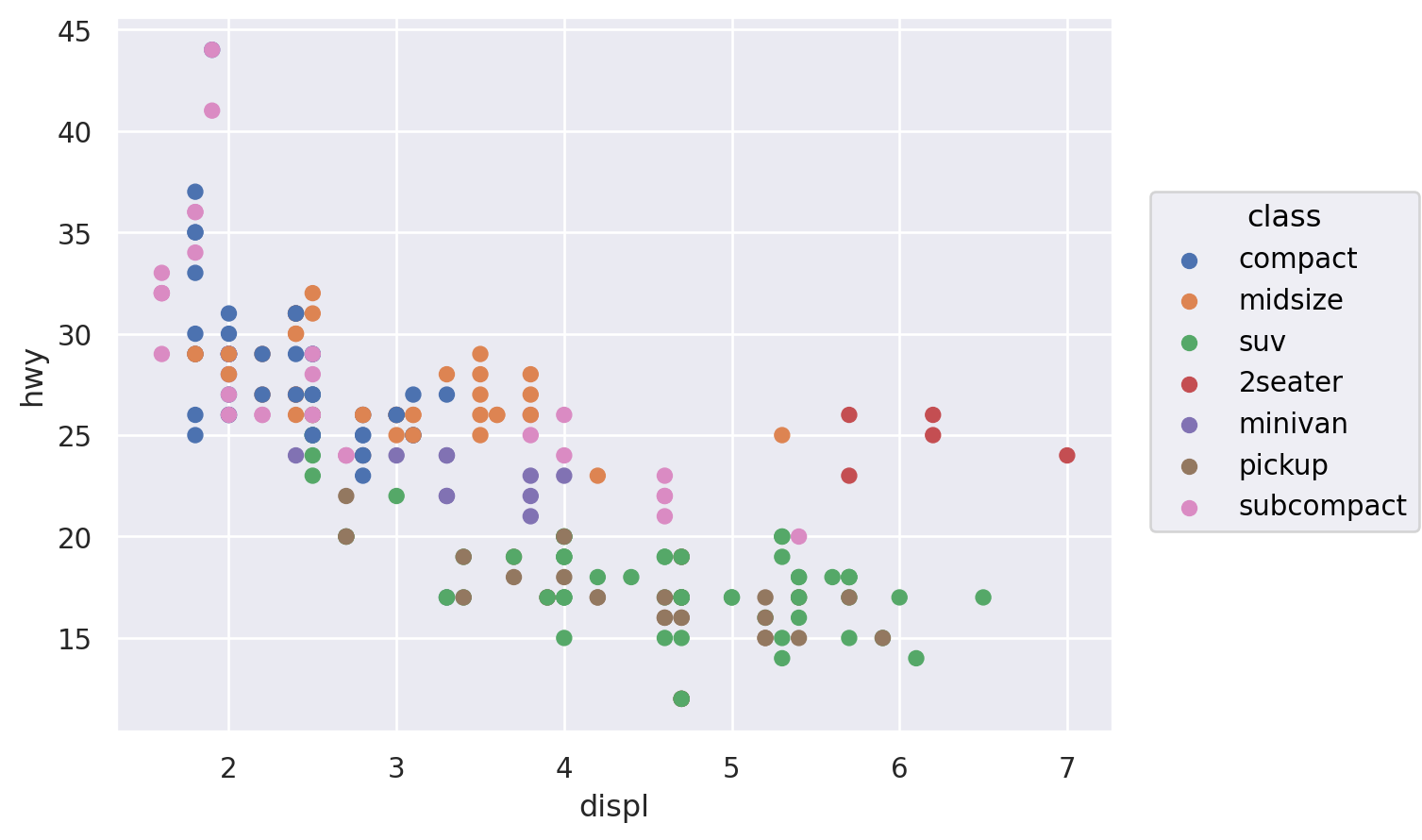
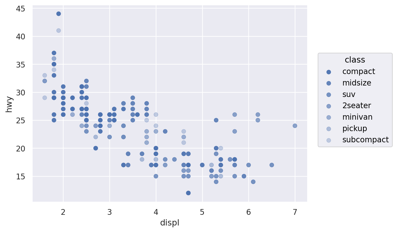
map the class variable to colour
ggplot
ggplot(mpg, aes(displ, hwy, colour = class)) +
  geom_point()
seaborn
(
    so.Plot(mpg, x="displ", y="hwy", color="class")
    .add(so.Dot())
)
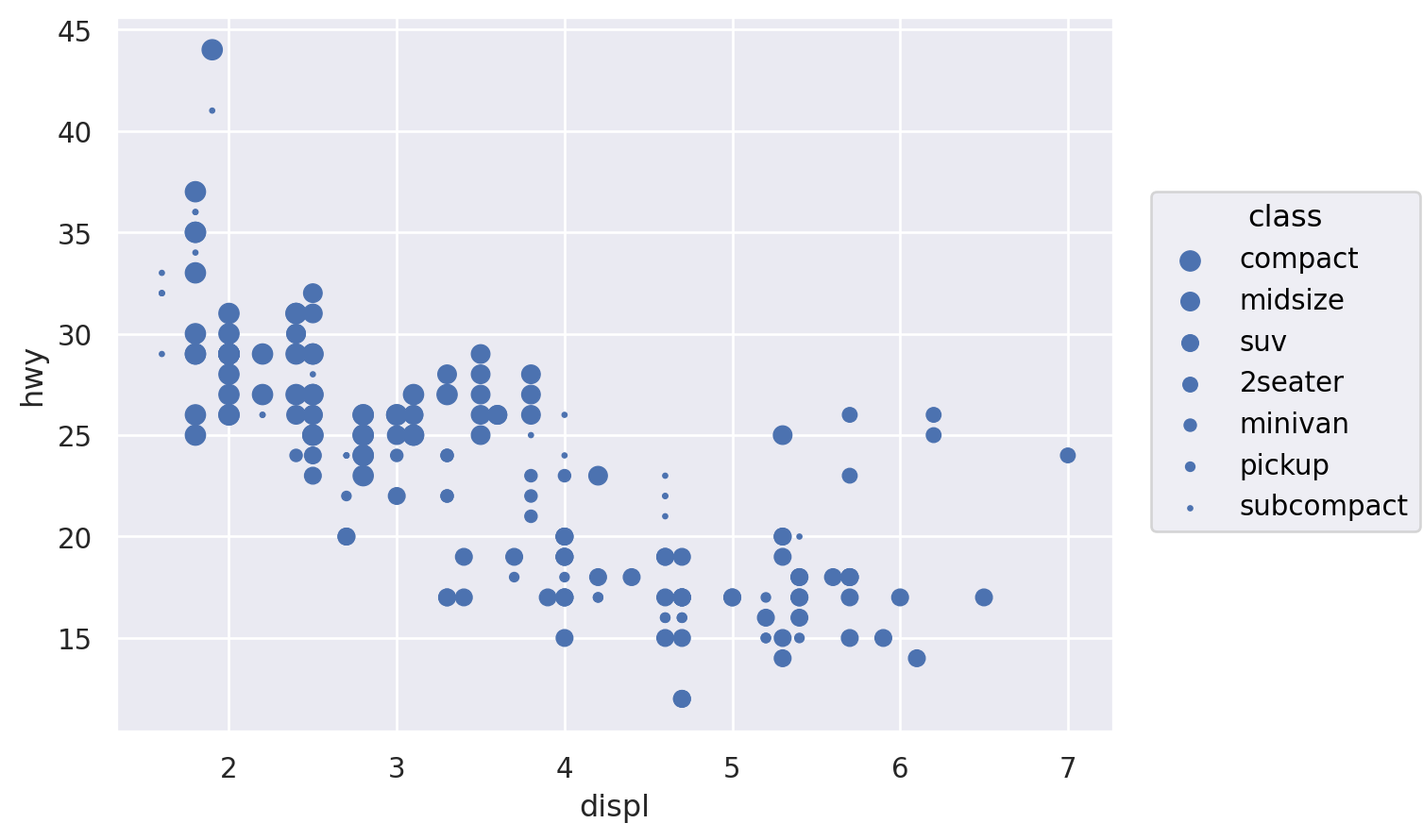
map the class variable to pointsize
ggplot
ggplot(mpg, aes(displ, hwy, size = class)) +
  geom_point()
seaborn
(
    so.Plot(mpg, x="displ", y="hwy", pointsize="class")
    .add(so.Dot())
)
map the class variable to alpha
ggplot
ggplot(mpg, aes(displ, hwy, alpha = class)) +
  geom_point()
seaborn
(
    so.Plot(mpg, x="displ", y="hwy", alpha="class")
    .add(so.Dot())
)
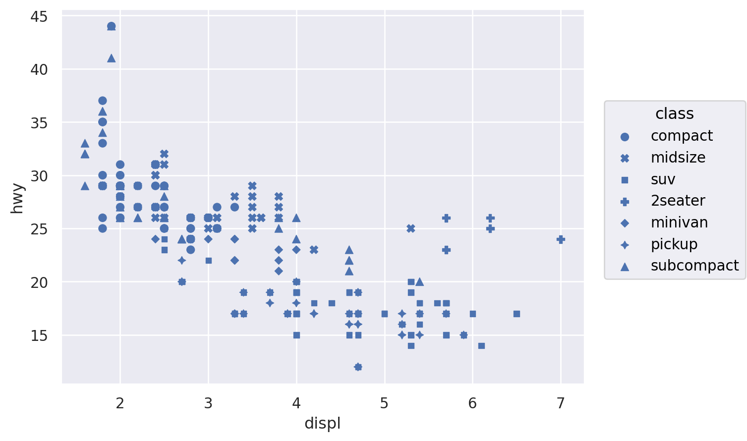
map the class variable to shape
ggplot
ggplot(mpg, aes(displ, hwy, shape = class)) +
  geom_point()
seaborn
(
    so.Plot(mpg, x="displ", y="hwy", marker="class")
    .add(so.Dot())
)
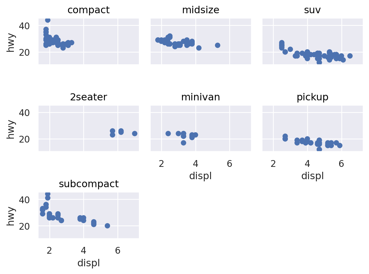
Faceting
ggplot
ggplot(mpg, aes(displ, hwy)) +
  geom_point() +
  facet_wrap(~class)
seaborn
the wrap=3 argument limits it to 3 plots per column, like the ggplot example
(
    so.Plot(mpg, x="displ", y="hwy")
    .add(so.Dot())
    .facet("class", wrap=3)
)
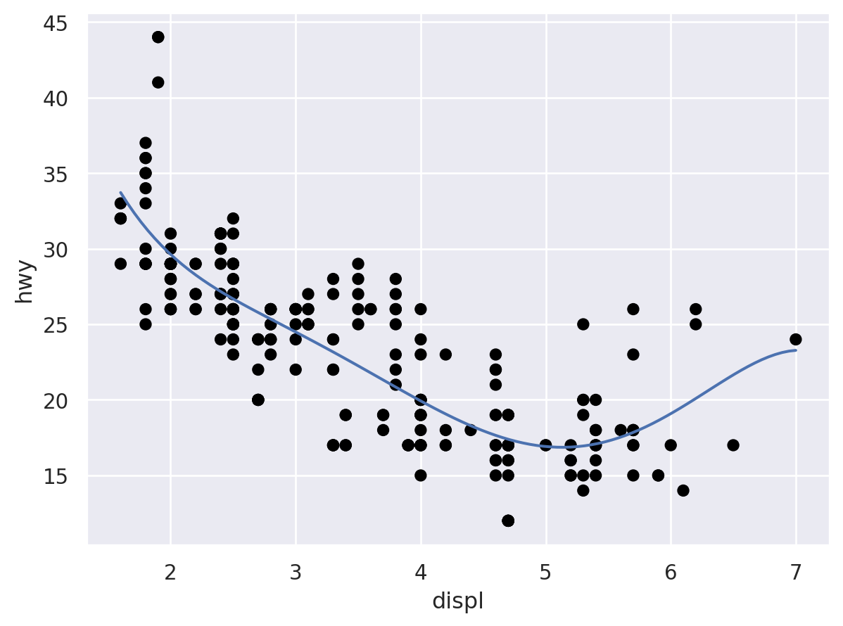
Adding a smoother to a plot
ggplot
ggplot(mpg, aes(displ, hwy)) +
  geom_point() +
  geom_smooth()
seaborn
Unfortunately, seaborn objects does not have an option for a confidence band yet (StackOverflow discussion) and the smoother is not LOESS (as in ggplot) but a polynomial fit
(
    so.Plot(mpg, x="displ", y="hwy")
    .add(so.Dot(color="black"))
    .add(so.Line(), so.PolyFit(order=5))
)
Boxplots
seaborn objects does not yet support boxplots and violinplots
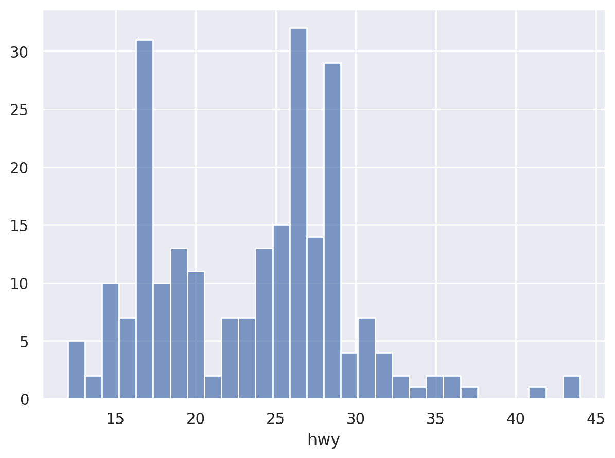
Histograms and frequency polygons
ggplot
ggplot(mpg, aes(hwy)) + geom_histogram()
seaborn
(
    so.Plot(mpg, x="hwy")
    .add(so.Bars(), so.Hist(bins=30))
)
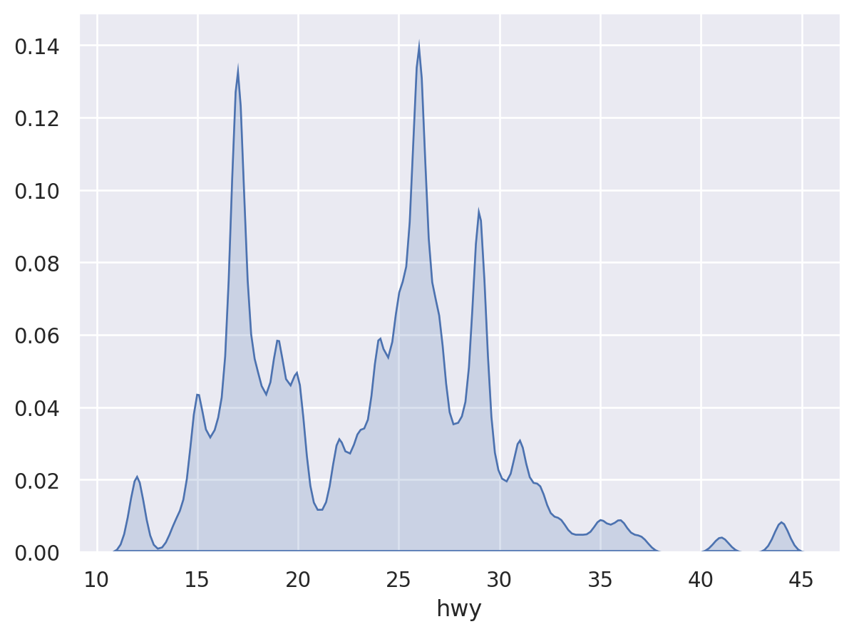
seaborn does not support frequency polygons, so we use KDE instead
ggplot
ggplot(mpg, aes(hwy)) + geom_freqpoly(binwidth = 1)
seaborn
(
    so.Plot(mpg, x="hwy")
    .add(so.Area(), so.KDE(bw_adjust=0.2))
)
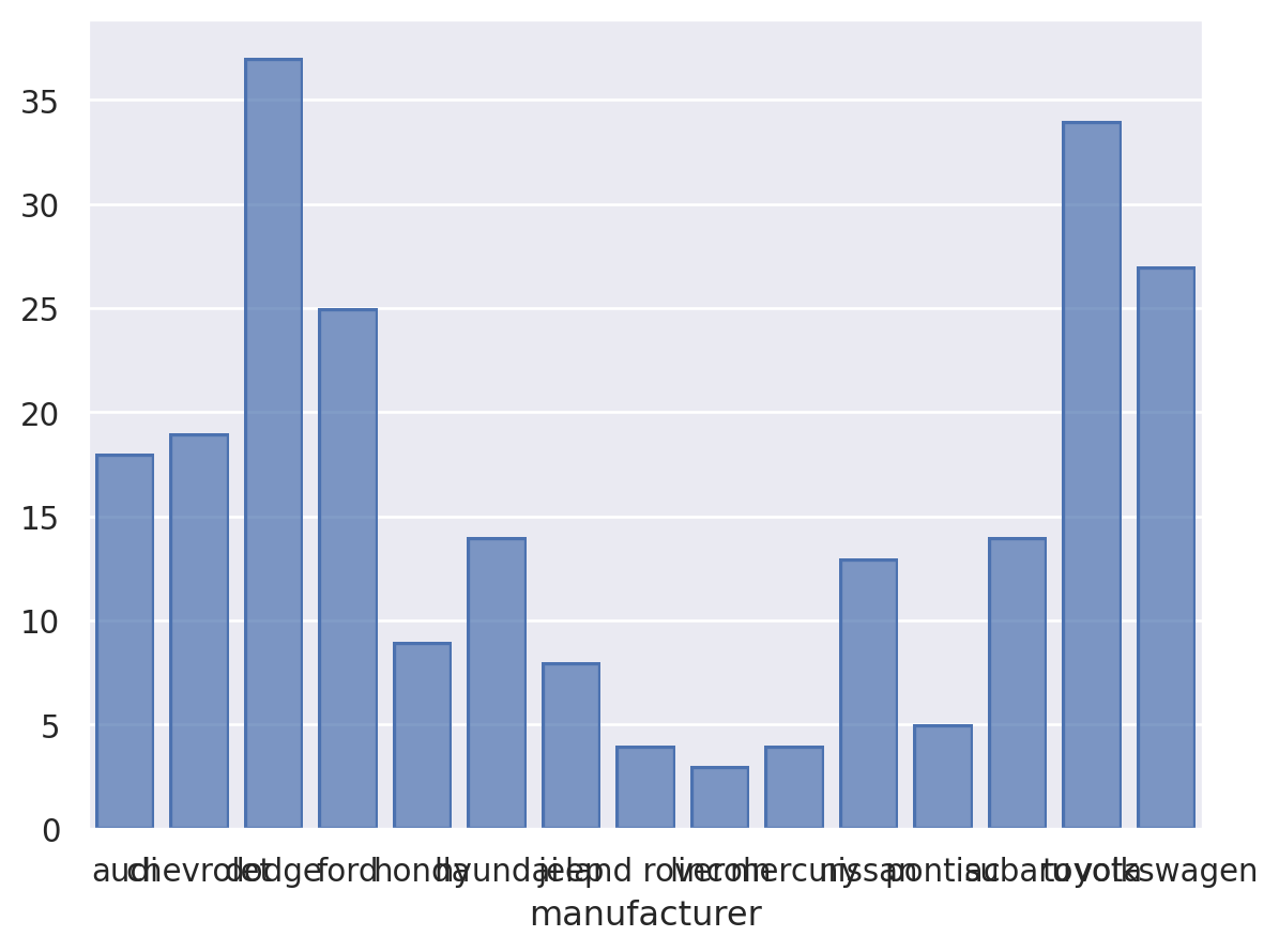
Bar charts
ggplot
ggplot(mpg, aes(manufacturer)) +
  geom_bar()
seaborn
(
    so.Plot(mpg, x="manufacturer")
    .add(so.Bar(), so.Hist())
)
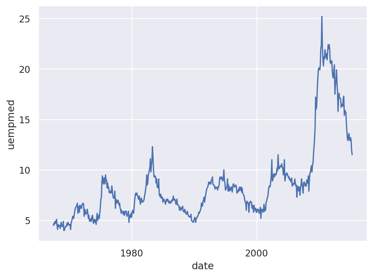
Time series
ggplot
ggplot(economics, aes(date, uempmed)) +
  geom_line()
seaborn
economics = pl.read_csv("https://raw.githubusercontent.com/tidyverse/ggplot2/main/data-raw/economics.csv", try_parse_dates=True, dtypes={"pop": pl.Float32})
(
    so.Plot(economics.to_pandas(), x="date", y="uempmed")
    .add(so.Path())
)